
I have decided to continue on Linkedin to share my thoughts on data science, tips and tricks and opinions. No new content here on WordPress anymore.
Uncategorized
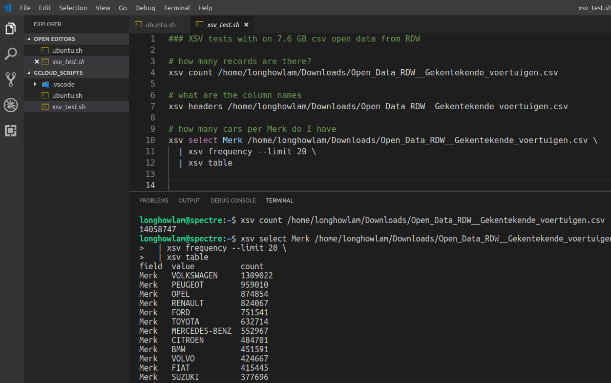
XSV tool
From time to time you do get large csv files. Take for example the open data from RDW with all the vehicles in The Netherlands. The size is ~ 7.6 GB (14 mln. rows and 64 columns), its not even really that large, but large enough for notepad, wordpad and Excel to hang….
There is a nice and handy tool XSV, see the github repo.
You can use it for some quick stats of the csv file and even some basic manipulations. For my csv file, It takes around 17 secs to count the number of records, around 18 secs to aggregate on a column.
In R data.table it took 2 minutes to import the set and in Python pandas 2.5 minutes
#CommandlineToolsAreStillCool #XSV #CSV
SatRday talks recordings

A couple of weeks ago, the first of September we had satRday in Amsterdam (The Netherlands) a fantastic event hosted by GoDataDriven. Now the great talks, including my 10 minute lightning talk on text2vec are online.
Cheers, Longhow
Google AutoML rocks!
Waaauw Google AutoML Vision rocks!
A few months ago I performed a simple test with Keras to create a Peugeot – BMW image classifier on my laptop.
See Is that a BMW or a Peugeot?
A friendly encouragement from Erwin Huizenga to try Google AutoML Vision resulted in a very good BMW-Peugeot classifier 10 minutes later without a single line of code. Just a few simple steps were needed.
- Upload your car images and label them.

- Click train (first hour of training is for free!)
- After 10 minutes the model was trained, with very good precision and recall.

And the nice thing: The model is up-and-running for anyone or any client application who needs an image prediction.

Just give it a try……Google AutoML Vision!
Dutch data science poetry

Sorry, hebben jullie heel even? Een dag uit een data saai-entist leven.
Dit is dan weer zo’n dag, waar helemaal niets meer mag. Wacht al een uur op mijn query, crasht ie!!! en doet ie het weer nie.
Ik train een mooie decision tree, Maar mijn model redt het nie. Doe dan maar mijn neuraal netwerk, Hmm, voorspellend vermogen, ook niet sterk.
Dan maar een rondje langs de business, ze snappen me niet, er is iets mis! Het regent buiten echt pijpenstelen, tijd om mijn werk maar op Git te delen.
Recruiters staan op je voice mail te gillen, Thuis ben je gewoon de aardappels aan het schillen. Nou ja, Tijd om naar bed te gaan, morgen maar weer verder met mijn sexy baan!
LL.
Echt HEMA….
Er zijn zoveel interessante technieken in het data science vakgebied, het is moeilijk om dat allemaal bij te houden. Werd laatst getriggered door UMAP (Uniform Manifold Approximation and Projection) voor dimensie reductie.
Als ik het artikel (https://lnkd.in/eGPxspP) doorlees krijg ik nostalgische herinneringen aan mijn Analyse I, II en III vakken aan de VU over o.a. Riemann manifolds!
Een friovole/ludieke vingeroefening met HEMA data om eens te spelen met UMAP. De stappen zijn simpel:
- Scrape wat Hema product plaatjes van de site.
- Haal deze plaatjes door een pre-trained deeplearning netwerk waar de top layer vanaf is gehaald.
- Elk plaatje is nu omgezet in een hoog dimensionele feature vector.
- Pas UMAP toe om de dimensie naar drie te reduceren.
- Zet in een interactieve Shiny app….. see here

Amsterdam in an R leaflet nutshell

The municipal services of Amsterdam (The Netherlands) is providing open panorama images. See here and here. A camera car has driven around in the city, and now you can download these images.
Per neighborhood of Amsterdam I randomly sampled 20 images and put them in an animated gif using R magick and the put it on a interactive leaflet map.
Before you book your tickets to Amsterdam, have a quick look here on the leaflet first 🙂
t-sne dimension reduction on Spotify mp3 samples

Introduction
Not long ago I was reading on t-Distributed Stochastic Neighbor Embedding (t-sne), a very interesting dimension reduction technique, and on Mel frequency cepstrum a sound processing technique. Details of both techniques can be found here and here. Can we combine the two in a data analysis exercise? Yes, and with not too much R code you can already quickly create some visuals to get ‘musical’ insights.
Spotify Data
Where can you get some sample audio files? Spotify! There is a Spotify API which allows you to get information on playlists, artists, tracks, etc. Moreover, for many songs (not all though) Spotify provides downloadable preview mp3’s of 30 seconds. The link to the preview mp3 can be retrieved from the API. I am going to use some of these mp3’s for analysis.
In the web interface of Spotify you can look for interesting playlists. In the search field type in for example ‘Bach‘ (my favorite classical composer). In the search results go to the playlists tab, you’ll find many ‘Bach’ playlists from different users, including the ‘user’ Spotify itself. Now, given the user_id (spotify) and the specific playlist_id (37i9dQZF1DWZnzwzLBft6A for the Bach playlist from Spotify) we can extract all the songs using the API:
GET https://api.spotify.com/v1/users/{user_id}/playlists/{playlist_id}
You will get the 50 Bach songs from the playlist, most of them have a preview mp3. Let’s also get the songs from a Heavy Metal play list, and a Michael Jackson play list. In total I have 146 songs with preview mp3’s in three ‘categories’:
- Bach,
- Heavy Metal,
- Michael Jackson.
Transforming audio mp3’s to features
The mp3 files need to be transformed to data that I can use for machine learning, I am going to use the Python librosa package to do this. It is easy to call it from R using the reticulate package.
library(reticulate)
librosa = import("librosa")

#### python environment with librosa module installed
use_python(python = "/usr/bin/python3")
The downloaded preview mp3’s have a sample rate of 22.050. So a 30 second audio file has in total 661.500 raw audio data points.
onemp3 = librosa$load("mp3songs/bach1.mp3")

length(onemp3[[1]])
length(onemp3[[1]])/onemp3[[2]]  # ~30 seconds sound

## 5 seconds plot
pp = 5*onemp3[[2]]
plot(onemp3[[1]][1:pp], type="l")
A line plot of the raw audio values will look like.

For sound processing, features extraction on the raw audio signal is often applied first. A commonly used feature extraction method is Mel-Frequency Cepstral Coefficients (MFCC). We can calculate the MFCC for a song with librosa.
ff = librosa$feature
mel = librosa$logamplitude(
  ff$melspectrogram(
    onemp3[[1]],
    sr = onemp3[[2]],
    n_mels=96
  ),
  ref_power=1.0
)
image(mel)

Each mp3 is now a matrix of MFC Coefficients as shown in the figure above. We have less data points than the original 661.500 data points but still quit a lot. In our example the MFCC are a 96 by 1292 matrix, so 124.032 values. We apply a the t-sne dimension reduction on the MFCC values.
Calculating t-sne
A simple and easy approach, each matrix is just flattened. So a song becomes a vector of length 124.032. The data set on which we apply t-sne consist of 146 records with 124.032 columns, which we will reduce to 3 columns with the Rtsne package:
tsne_out = Rtsne(AllSongsMFCCMatrix, dims=3)
The output object contains the 3 columns, I have joined it back with the data of the artists and song names so that I can create an interactive 3D scatter plot with R plotly. Below is a screen shot, the interactive one can be found here.

Conclusion
It is obvious that Bach music, heavy metal and Michael Jackson are different, you don’t need machine learning to hear that. So as expected, it turns out that a straight forward dimension reduction on these songs with MFCC and t-sne clearly shows the differences in a 3D space. Some Michael Jackson songs are very close to heavy metal 🙂 The complete R code can be found here.
Cheers, Longhow
Dataiku 4.1.0: More support for R users!

Introduction
Recently, Dataiku 4.1.0 was released, it now offers much more support for R users. But wait a minute, Data-what? I guess some of you do not know Dataiku, so what is Dataiku in the first place? It is a collaborative data science platform created to design and run data products at scale. The main themes of the product are:
Collaboration & Orchestration: A data science project often involves a team of people with different skills and interests. To name a few, we have data engineers, data scientists, business analysts, business stakeholders, hardcore coders, R users and Python users. Dataiku provides a platform to accommodate the needs of these different roles to work together on data science projects.
Productivity: Whether you like hard core coding or are more GUI oriented, the platform offers an environment for both. A flow interface can handle most of the steps needed in a data science project, and this can be enriched by Python or R recipes. Moreover, a managed notebook environment is integrated in Dataiku to do whatever you want with code.
Deployment of data science products: As a data scientist you can produce many interesting stuff, i.e. graphs, data transformations, analysis, predictive models. The Dataiku platform facilitates the deployment of these deliverables, so that others (in your organization) can consume them. There are dashboards, web-apps, model API’s, productionized model API’s and data pipelines.

There is a free version which contains already a lot of features to be very useful, and there is an paid version, with “enterprise features“. See for the Dataiku website for more info.
Improved R Support in 4.1.0
Among many new features, and the one that interests me the most as an R user, is the improved support for R. In previous versions of Dataiku there was already some support for R, this version has the following improvements. There is now support for:
R Code environments
In Dataiku you can now create so-called code environments for R (and Python). A code environment is a standalone and self-contained environment to run R code. Each environment can have its own set of packages (and specific versions of packages). Dataiku provides a handy GUI to manage different code environments. The figure below shows an example code environment with specific packages.

In Dataiku whenever you make use of R –> in R recipes, Shiny, R Markdown or creating R API’s you can select a specific R code environment to use.
R Markdown reports & Shiny applications
If you are working in RStudio you most likely already know R Markdown documents and Shiny applications. In this version, you can also create them in Dataiku. Now, why would you do that and not just create them in RStudio? Well, the reports and shiny apps become part of the Dataiku environment and so:
- They are managed in the environment. You will have a good overview of all reports and apps and see who has created/edited them.
- You can make use of all data that is already available in the Dataiku environment.
- Moreover, the resulting reports and Shiny apps can be embedded inside Dataiku dashboards.

The figure above shows a R markdown report in Dataiku, the interface provides a nice way to edit the report, alter settings and publish the report. Below is an example dashboard in Dataiku with a markdown and Shiny report.

Creating R API’s
Once you created an analytical model in R, you want to deploy it and make use of its predictions. With Dataiku you can now easily expose R prediction models as an API. In fact, you can expose any R function as an API. The Dataiku GUI provides an environment where you can easily set up and test an R API’s. Moreover, The Dataiku API Node, which can be installed on a (separate) production server imports the R models that you have created in the GUI and can take care of load balancing, high availability and scaling of real-time scoring.
The following three figures give you an overview of how easy it is to work with the R API functionality.
First, define an API endpoint and R (prediction) function.

Then, define the R function, it can make use of data in Dataiku, R objects created earlier or any R library you need.

Then, test and deploy the R function. Dataiku provides a handy interface to test your function/API.

Finally, once you are satisfied with the R API you can make a package of the API, that package can then be imported on a production server with Dataiku API node installed. From which you can then serve API requests.
Conclusion
The new Dataiku 4.1.0 version has a lot to offer for anyone involved in a data science project. The system already has a wide range support for Python, but now with the improved support for R, the system is even more useful to a very large group of data scientists.
Cheers, Longhow.
Oil leakage… those old BMW’s are bad :-)

Introduction
My first car was a 13 year Mitsubishi Colt, I paid 3000 Dutch Guilders for it. I can still remember a friend that would not like me to park this car in front of his house because of possible oil leakage.

Can you get an idea of which cars will likely to leak oil? Well, with open car data from the Dutch RDW you can. RDW is the Netherlands Vehicle Authority in the mobility chain.
RDW Data
There are many data sets that you can download. I have used the following:
- Observed Defects. This set contains 22 mln. records on observed defects at car level (license plate number). Cars in The Netherlands have to be checked yearly, and the findings of each check are submitted to RDW.
- Basic car details. This set contains 9 mln. records, they are all the cars in the Netherlands, license plate number, brand, make, weight and type of car.
- Defects code. This little table provides a description of all the possible defect codes. So I know that code ‘RA02’ in the observed defects data set represents ‘oil leakage’.
Simple Analysis in R
I have imported the data in R and with some simple dplyr statements I have determined per car make and age (in years) the number of cars with an observed oil leakage defect. Then I have determined how many cars there are per make and age, then dividing those two numbers will result in a so called oil leak percentage.
For example, in the Netherlands there are 2043 Opel Astra’s that are four years old, there are three observed with an oil leak, so we have an oil leak percentage of 0.15%.
The graph below shows the oil leak percentages for different car brands and ages. Obviously, the older the car the higher the leak percentage. But look at BMW: waaauwww those old BMW’s are leaking like oil crazy… 🙂 The few lines of R code can be found here.
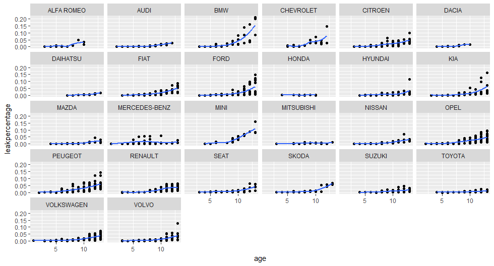
Conclusion
There is a lot in the open car data from RDW, you can look at much more aspects / defects of cars. Regarding my old car that i had, according to this data Mitsubishi’s have a low oil leak percentage, even older ones.
Cheers, Longhow
