Dataiku with RStudio integration

Introduction

Some time ago I wrote about the support for R users within Dataiku. The software can really boost the productivity of R users by having:

  • Managed R code environments,
  • Support for publishing of R markdown files and shiny apps in Dataiku dashboards,
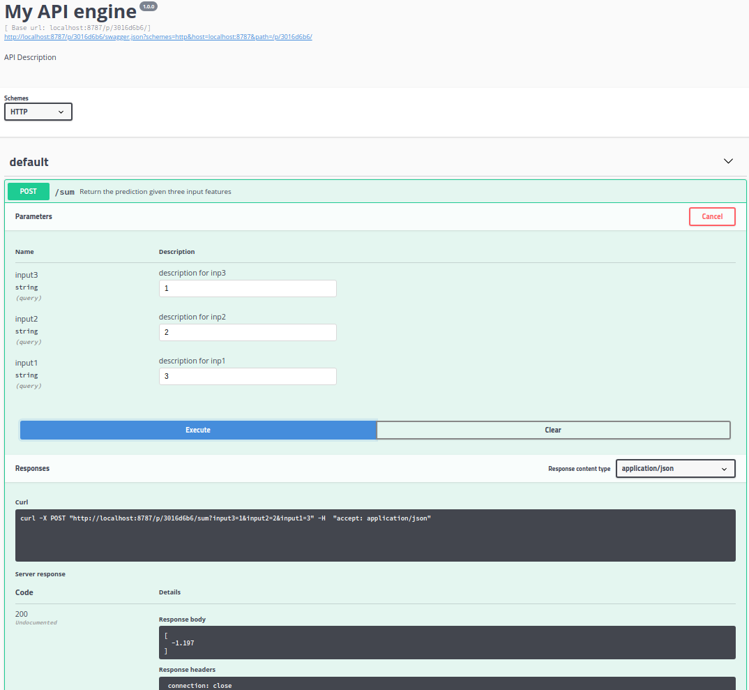
  • The ability to easily create and deploy API’s based on R functions.

See the blog post here.

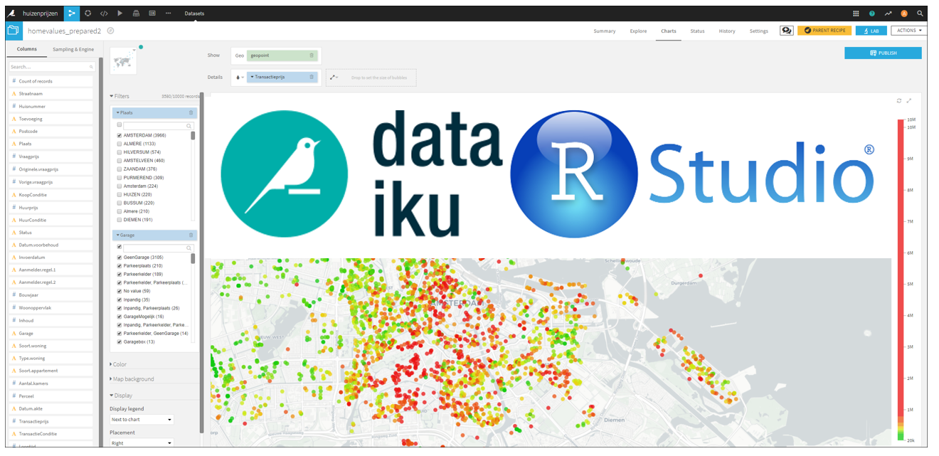
With the 5.1 release of Dataiku two of my favorite data science tools are brought closely together :-). Within Dataiku there is now a nice integration with RStudio. And besides this, there is much more new functionality in the system, see the 5.1 release notes.

RStudio integration

From time to time, the visual recipes to perform certain tasks in Dataiku are not enough for what you want to do. In that case you can make use of code recipes. Different languages are supported, Python, Scala, SQL, shell and R. To edit the R code you are provided with an editor in Dataiku, it is however, not the best editor I’ve seen. Especially when you are used to the RStudio IDE 🙂

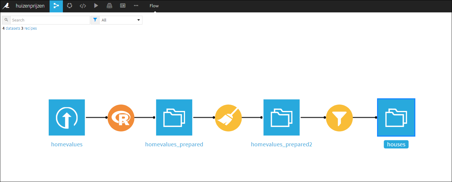
There is no need to create a new R editor, that would be a waist of time and resources. In Dataiku you can now easily use the RStudio environment in your Dataiku workflow.

Suppose you are using an R code recipe in your workflow, then in the code menu in Dataiku you can select ‘RStudio server’. It will bring you to an RStudio session (embedded) in the Dataiku interface (either on the same Dataiku server or on a different server).

In your (embedded) RStudio session you can easily ‘communicate’ with the Dataiku environment. There is a ‘dataiku’ R package that exposes functions and RStudio add-ins to make it easy to communicate with Dataiku. You can use it to bring over R code recipes and / or data from Dataiku. This will allow you to edit and test the R code recipe in RStudio with all the features that a modern IDE should have.

Once you are done editing and testing in RStudio you can then upload the R code recipe back to the Dataiku workflow. If your happy with the complete Dataiku workflow, put it into production, i.e. run it in database, or deploy it as an API. See this short video for a demo.

Stay tuned for more Dataiku and R updates….. Cheers, Longhow.

Are you leaking h2o? Call plumber!

Create a predictive model with the h2o package.

H2o is a fantastic open source machine learning platform with many different algorithms. There is Graphical user interface, a Python interface and an R interface. Suppose you want to create a predictive model, and you are lazy then just run automl.

Lets say, we have both train and test data sets, and the first column is the target and the columns 2 until 50 are input features. Then we can use the following code in R

out = h2o.automl(
   x = 2:50, 
   y = 1,
   training_frame = TrainData, 
   validation_frame = TestData, 
   max_runtime_secs = 1800
)

According the help documentation: The current version of automl trains and cross-validates a Random Forest, an Extremely-Randomized Forest, a random grid of Gradient Boosting Machines (GBMs), a random grid of Deep Neural Nets, and then trains a Stacked Ensemble using all of the models.

After a time period that you can set, automl will terminate and has literally tried hundreds of models. You can get the top models, ranked by a certain performance metric. If you go for the champion just use:

championModel = out@leaderchampionModel

Now the championModel object can be used to score / predict new data with the simple call:

predict(championModel, newdata)

The champion model now lives on my laptop, it’s hard if not impossible to use this model in production. Someone or some process that wants a model score should not depend on you and your laptop!

Instead, the model should be available on a server where model prediction requests can be handled 24/7. This is where plumber comes in handy. First save the champion model to disk so that we can use it later.

h2o.saveModel(championModel, path = "myChampionmodel")

The plumber package, bring your model in production.

In a very simple and concise way, the plumber package allows users to expose existing R code as an API service available to others on the web or intranet. Now suppose you have a saved h2o model with three input features, how can we create an API from it? You decorate your R scoring code with special comments, as shown in the example code below.

# This is a Plumber API. In RStudio 1.2 or newer you can run the API by
# clicking the 'Run API' button above.

library(plumber)library(h2o)
h2o.init()
mymodel = h2o.loadModel("mySavedModel")

#* @apiTitle My model API engine

#### expose my model #################################
#* Return the prediction given three input features
#* @param input1 description for inp1
#* @param input2 description for inp2
#* @param input3 description for inp3
#* @post /mypredictivemodel
function( input1, input2, input3){
   scoredata = as.h2o(
      data.frame(input1, input2, input3 )
   )
   as.data.frame(predict(mymodel, scoredata))
}

To create and start the API service, you have to put the above code in a file and call the following code in R.

rapi <- plumber::plumb("plumber.R")  # Where 'plumber.R' is the location of the code file shown above 
rapi$run(port=8000)

The output you see looks like:

Starting server to listen on port 8000 
Running the swagger UI at http://127.0.0.1:8000/__swagger__/

And if you go to the swagger UI you can test the API in a web interface where you can enter values for the three input parameters.

What about Performance?

At first glance I thought there might be quit some overhead, calling the h2o library, loading the h2o predictive model and then using the h2o predict function to calculate a prediction given the input features.

But I think it is workable. I installed R, h2o and plumber on a small n1-standard-2 Linux server on the Google Cloud Platform. One API call via plumber to calculate a prediction with a h2o random forest model with 100 trees took around 0.3 seconds to finish.

There is much more that plumber has to offer, see the full documentation.

Cheers, Longhow.

Selecting ‘special’ photos on your phone

At the beginning of the new year I always want to clean up my photos on my phone. It just never happens.

So now (like so many others I think) I have a lot of photos on my phone from the last 3.5 years. The iPhone photos app helps you a bit to go through your photos. But which ones are really special and you definitely want to keep?

Well, just apply some machine learning.

  1. I run all my photos through a VGG16 deep learning model to generate high dimensional features per photo (on my laptop without GPU this takes about 15 minutes for 2000 photos).
  2. The dimension is 25.088, which is difficult to visualize. I apply a UMAP dimension reduction to bring it back to 3.
  3. In R you can create an interactive 3D plot with plotly where each point corresponds to a photo. Using crosstalk, you can link it to the corresponding image. The photo appears when you hover over the point.

Well a “special” outlying picture in the scatter plot are my two children with a dog during a holiday a few years ago. I had never found it that fast. There are some other notable things that I can see, but I won’t bother you with it here 🙂

Link GitHub repo with to two R scripts to cluster your own photos. Cheers, Longhow

An R Shiny app to recognize flower species

Introduction

Playing around with PyTorch and R Shiny resulted in a simple Shiny app where the user can upload a flower image, the system will then predict the flower species.

Steps that I took

  1. Download labeled flower data from the Visual Geometry Group,
  2. Install Pytorch and download their transfer learning tutorial script,
  3. You need to slightly adjust the script to work on the flower data,
  4. Train and Save the model as a (*.pt) file, 
  5. Using the R reticulate package you can call python code from within R so that you can use a pytorch models in R,
  6. Create a Shiny app that allows the user to upload an image and display the predicted flower species.

Some links

Github repo with: Python notebook to fine tune the resnet18 model, R script with Shiny App, data folder with images.

Live running shiny app can be found here. 

Cheers, Longhow

Cucumber time, food on a 2D plate / plane

komkommer

Introduction

It is 35 degree Celsius out side, we are in the middle of the ‘slow news season’, in many countries also called cucumber time.  A period typified by the appearance of less informative and frivolous news in the media.

Did you know that 100 g of cucumber contain 0.28 mg of iron and 1.67 g of sugar? You can find all the nutrient values of a cucumber on the USDA food databases.

Food Data

There is more data, for many thousands of products you can retrieve nutrient values through an API (need to register for a free KEY). So besides the cucumber I extracted data for different type of food for example

  • Beef products
  • Dairy & Egg products
  • Vegetables
  • Fruits
  • etc.

And as a comparison, I retrieved the nutrient values for some fast food products from McDonald’s and Pizza Hut. Just to see if pizza can be classified  as vegetable from a data point of view 🙂 So the data looks like:

Selection_078

I have sampled 1500 products and per product we have 34 nutrient values.

Results

The 34 dimensional data is now compressed / projected onto a two dimensional plane using UMAP (Uniform Manifold Approximation and Projection). There is a Python and R package to this.

Selection_079

An interactive map can be found here, and the R code to retrieve and plot the data here. Cheers, Longhow.


Amsterdam in an R leaflet nutshell

amsterdamanimatie2

The municipal services of Amsterdam (The Netherlands) is providing open panorama images. See here and here. A camera car has driven around in the city, and now you can download these images.

Per neighborhood of Amsterdam  I randomly sampled 20 images and put them in an animated gif using R magick and the put it on a interactive leaflet map.

Before you book your tickets to Amsterdam, have a quick look here on the leaflet first 🙂


Is that a BMW or a Peugeot?

bmw.PNG

Introduction

My son is 8 years old and he has shown a lot of interest in cars, which is strange because I have zero interest in cars. But he is driving me crazy when we have a car ride: “dad is that an Peugeot?“, “dad, that is an Audi” and “that is a BMW, right?“, “That is another cool BMW, why don’t we have a BMW?“. He is pretty accurate, close to 100%! I was curious how accurate a very simple model could get. Just a re-use of a pre-trained image model approach on my laptop without any GPU’s.

Image Data

There is a nice python package google-images-download to help you download certain images.

from google_images_download import google_images_download 
response = google_images_download.googleimagesdownload()  

arguments = {
  "keywords": "BMW,PEUGEOT",
  "print_urls": False,
  "suffix_keywords": "car",
  "output_directory": "TMP",
   "format": "png"
}

response.download(arguments) 

The above code will get you images of BMW’s and Peugeots, the problem though is that not all images are actually cars. You’ll see scooters, navigation systems and garages. Moreover, some downloaded files do not open at all.

autos

So first, we can use a pre-trained resnet50 or vgg16 image classifier and run the downloaded files through this classifier and keep only the images that keras can open and were classified as car or wagon. Then the images are organized in the following folder structure

├── training
│   ├── bmw (150 images)
│   └── peugeot(150 images)
└── validation
    ├── bmw (50 images)
    └── peugeot(50 images)

Predictive model

I am using the most simple approach, both in terms of modeling and computational effort. It is described in section 5.3 of this fantastic book “Deep Learning in R” by François Chollet and J. J. Allaire.

  • Take a pretrained network, say VGG16, remove the top so that you only have a convolutional base.
  • Now run your images trough this base so that each image is a tensor.
  • Treat these tensors as input for a complete separate neural network classifier. For example a simple one hidden fully connected layer with 256 neurons, shown in the code snippet below.
model <- keras_model_sequential() %>%
  layer_dense(
    units = 256, 
    activation = "relu", 
    input_shape = 4 * 4 * 512
  ) %>%
  layer_dropout(rate = 0.5) %>%
  layer_dense(units = 1, activation = "sigmoid")

The nice thing is that once you have put your images in the proper folder structure you can just ‘shamelessly’ copy/paste the code from the accompanying markdown of the book and start training a BMW-Peugeot model.

model1_peugeot_bmw_loss

Conclusion

After 15 epochs or so the accuracy on the validation images flattens of to around 80% which is not super good and not even close to what my son can achieve 🙂 But it is not too bad either for just 30 minutes of work in R, mostly copy pasting code….. Cheers, Longhow.

t-sne dimension reduction on Spotify mp3 samples

Schermafdruk van 2018-01-30 12-25-08

Introduction

Not long ago I was reading on t-Distributed Stochastic Neighbor Embedding (t-sne), a very interesting dimension reduction technique, and on Mel frequency cepstrum a sound processing technique. Details of both techniques can be found here and here. Can we combine the two in a data analysis exercise? Yes, and with not too much R code you can already quickly create some visuals to get ‘musical’ insights.

Spotify Data

Where can you get some sample audio files? Spotify! There is a Spotify API which allows you to get information on playlists, artists, tracks, etc. Moreover, for many songs (not all though) Spotify provides downloadable preview mp3’s of 30 seconds. The link to the preview mp3 can be retrieved from the API. I am going to use some of these mp3’s for analysis.

In the web interface of Spotify you can look for interesting playlists. In the search field type in for example ‘Bach‘ (my favorite classical composer). In the search results go to the playlists tab, you’ll find many ‘Bach’ playlists from different users, including the ‘user’ Spotify itself. Now, given the user_id (spotify) and the specific playlist_id (37i9dQZF1DWZnzwzLBft6A for the Bach playlist from Spotify) we can extract all the songs using the API:

 GET https://api.spotify.com/v1/users/{user_id}/playlists/{playlist_id}

You will get the 50 Bach songs from the playlist, most of them have a preview mp3. Let’s also get the songs from a Heavy Metal play list, and a Michael Jackson play list. In total I have 146 songs with preview mp3’s in three ‘categories’:

  • Bach,
  • Heavy Metal,
  • Michael Jackson.

Transforming audio mp3’s to features

The mp3 files need to be transformed to data that I can use for machine learning, I am going to use the Python librosa package to do this. It is easy to call it from R using the reticulate package.

library(reticulate)
librosa = import("librosa")

#### python environment with librosa module installed
use_python(python = "/usr/bin/python3")

The downloaded preview mp3’s have a sample rate of 22.050. So a 30 second audio file has in total 661.500 raw audio data points.

onemp3 = librosa$load("mp3songs/bach1.mp3")

length(onemp3[[1]])
length(onemp3[[1]])/onemp3[[2]]  # ~30 seconds sound

## 5 seconds plot
pp = 5*onemp3[[2]]
plot(onemp3[[1]][1:pp], type="l")

A line plot of the raw audio values will look like.

tsne1

For sound processing, features extraction on the raw audio signal is often applied first. A commonly used feature extraction method is Mel-Frequency Cepstral Coefficients (MFCC). We can calculate the MFCC for a song with librosa.

ff = librosa$feature
mel = librosa$logamplitude(
  ff$melspectrogram(
    onemp3[[1]], 
    sr = onemp3[[2]],
    n_mels=96
  ),
  ref_power=1.0
)
image(mel)
tsne2

Each mp3 is now a matrix of MFC Coefficients as shown in the figure above. We have less data points than the original 661.500 data points but still quit a lot. In our example the MFCC are a 96 by 1292 matrix, so 124.032 values. We apply a the t-sne dimension reduction on the MFCC values.

Calculating t-sne

A simple and easy approach, each matrix is just flattened. So a song becomes a vector of length 124.032. The data set on which we apply t-sne consist of 146 records with 124.032 columns, which we will reduce to 3 columns with the Rtsne package:

tsne_out = Rtsne(AllSongsMFCCMatrix, dims=3) 

The output object contains the 3 columns, I have joined it back with the data of the artists and song names so that I can create an interactive 3D scatter plot with R plotly. Below is a screen shot, the interactive one can be found here.

tsne3

Conclusion

It is obvious that Bach music, heavy metal and Michael Jackson are different, you don’t need machine learning to hear that. So as expected, it turns out that a straight forward dimension reduction on these songs with MFCC and t-sne clearly shows the differences in a 3D space. Some Michael Jackson songs are very close to heavy metal 🙂 The complete R code can be found here.

Cheers, Longhow

The ‘I-Love-IKEA’ – web app, built at the IKEA Hackaton with R and Shiny

wordpress01

Introduction

On the 8th, 9th and 10th of December I participated at the IKEA hackaton. In one word it was just FANTASTIC! Well organized, good food, and participants from literally all over the world, even the heavy snow fall on Sunday did not stop us from getting there!

ikea01


I formed a team with Jos van Dongen and his son Thomas van Dongen and we created the “I-Love-IKEA” app to help customers find IKEA products. And of course using R.

oikea02

The “I-Love-IKEA” Shiny R app

The idea is simple. Suppose you are in the unfortunate situation that you are not in an IKEA store, and you see a chair, or nice piece of furniture, or something completely else…. Now does IKEA have something similar? Just take a picture, upload it using the I-Love-IKEA R Shiny app and get the best matching IKEA products back.

Implementation in R

How was this app created? The following steps outline steps that we took during the creation of the web app for the hackaton.

First, we have scraped 9000 IKEA product images using Rvest, then each image is ‘scored’ using a pre-trained VGG16 network, where the top layers are removed.

ikea03


That means that for each IKEA image we have a 7*7*512 tensor, we flattened this tensor to a 25088 dimensional vector. Putting all these vectors in a matrix we have a 9000 by 25088 matrix.

If you have a new image, we use the same pre-trained VGG16 network to generate a 25088 dimensional vector for the new image. Now we can calculate all the 9000 distances (for example cosine similarity) between this new image and the 9000 IKEA images. We select, say, the top 7 matches.

A few examples

ikea04

A Shiny web app

To make this useful for an average consumer, we have put it all in an R Shiny app using the library ‘minUI‘ so that the web site is mobile friendly. A few screen shots:

ikea05


The web app starts with an ‘IKEA-style’ instruction, then it allows you to take a picture with your phone, or use one that you already have on your phone. It uploads the image and searches for the best matching IKEA products.

ikea06

The R code is available from my GitHub, and a live running Shiny app can be found here.

Conclusions

Obviously, there are still many adjustments you can make to the app to improve the matching. For example pre process the images before they are sent through the VGG network. But there was no more time.

Unfortunately, we did not win a price during the hackaton, the jury did however find our idea very interesting. More importantly, we had a lot of fun. In Dutch “Het waren 3 fantastische dagen!”.

Cheers, Longhow.